
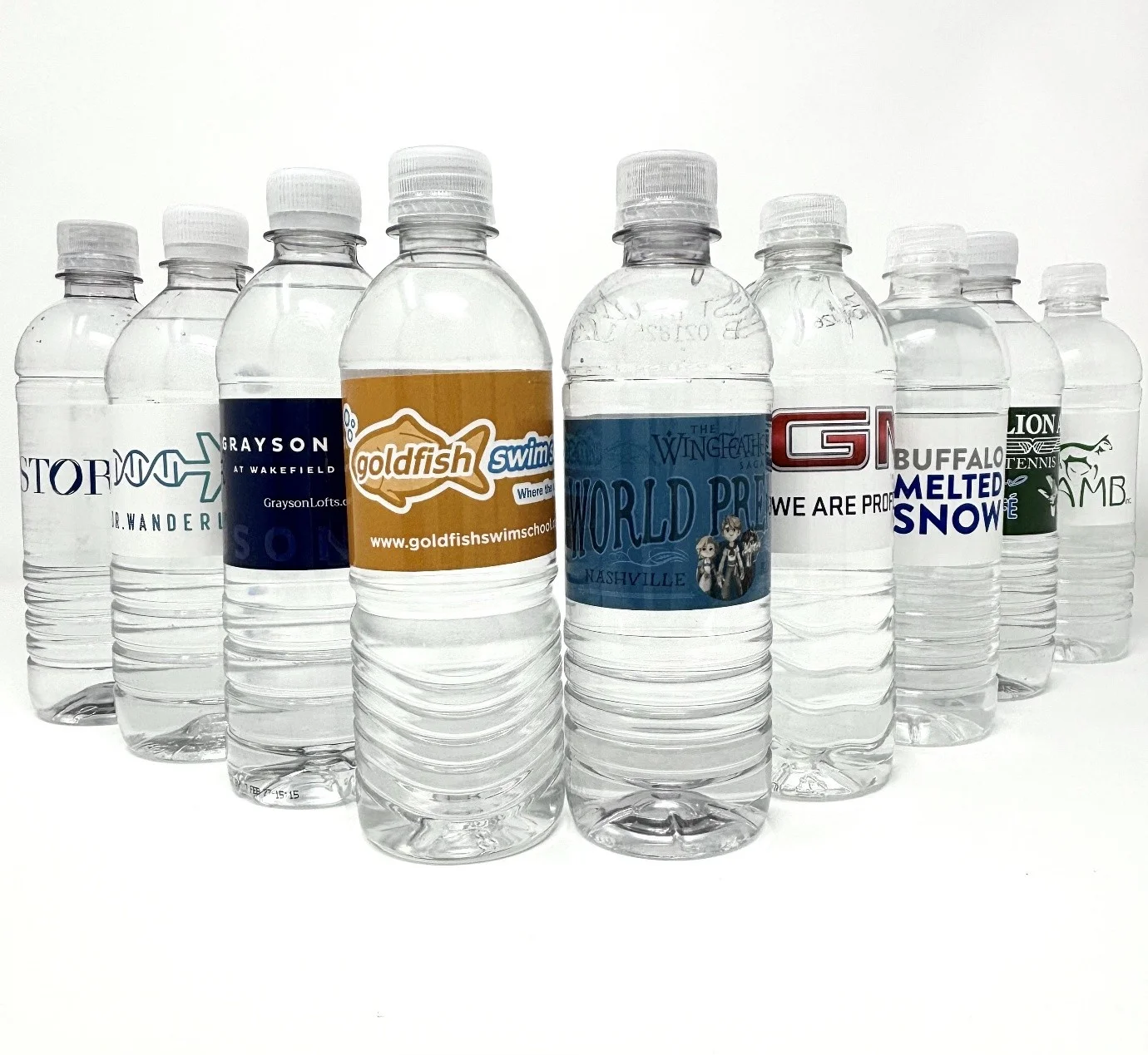
Water bottle advertisement plays a crucial role in influencing customer choices. Colors are not just decorative; they can affect emotions, behaviors, and buying decisions. A well-planned color strategy can turn a casual viewer into a loyal customer. Understanding color psychology in water bottle advertisement helps brands communicate effectively, build recognition, and increase sales. In this blog, we explore how colors impact perception, how to use them strategically, and why they matter for your brand’s success.
Colors speak to the brain before words or images. Each color triggers different feelings:
Using the right colors helps a water bottle advertisement speak directly to emotions, encouraging purchase decisions.
Colors affect different people in different ways. Teenagers may prefer vibrant colors like pink or neon green, while adults often respond to calm and subtle shades like light blue or gray. Knowing your audience helps you pick colors that resonate.
For example, a sports water bottle targeted at young athletes may use red or orange to signify energy. In contrast, eco-friendly bottles may highlight green and earthy tones to stress sustainability. The right color choice increases engagement and strengthens brand loyalty.
A brand’s color palette should align with its overall identity. Consistency in colors across water bottle advertisement, social media, and packaging builds recognition. Customers start associating specific colors with your brand, which improves trust and recall.
For instance, a brand emphasizing cleanliness and hydration may stick to blue and white, while a brand highlighting adventure or sports may use bright, bold colors. Each choice reflects the brand’s personality and communicates the right message.
Colors can trigger emotions subconsciously. They can make customers feel thirsty, energetic, relaxed, or motivated. Emotional connections often drive repeat purchases.
A successful water bottle advertisement uses colors to tap into emotions, making the product more appealing and memorable.
These strategies make a water bottle advertisement not just visually appealing but psychologically effective.
Color meanings can vary across cultures. Red may signal luck in some cultures and danger in others. Brands targeting global markets must understand these differences. For local campaigns, focus on colors familiar and appealing to the target audience. This ensures that your advertisement communicates the intended message clearly.
Current trends in water bottle advertisement emphasize minimalism and sustainability. Brands are leaning towards soft pastels, earthy tones, and transparent designs. These colors suggest purity, health, and eco-friendliness, which customers increasingly value. Incorporating trendy colors without losing brand identity can boost relevance and customer interest.
Track engagement and sales to see how well your color strategy works. Metrics include click-through rates, social media shares, and overall sales. Experimenting with colors in different ads allows brands to refine their strategies and optimize customer response.
Stop guessing about your marketing. The secret to an eye-catching water bottle advertisement is color. Color is what draws an emotional response, defines your brand, and instantly connects with your buyers. When you use color psychology correctly, your brand visibility soars, and sales follow. At The Water Depot, we believe in function meeting flair. We offer high-quality products paired with smart design strategies to make every advertisement on water effective and memorable. Our wide collection of water bottles, hydration solutions, and accessories is built for your daily life. Visit thewaterdepot.com today and find the perfect water solution that fits your lifestyle!
Colors affect emotions and perception. They can make a product seem trustworthy, exciting, or eco-friendly, which impacts buying choices.
Green and earthy tones are most effective, as they convey sustainability and health.
No. Colors affect different age groups and cultures differently. Knowing your audience is key.
Consistent colors strengthen brand identity, build recognition, and make ads more memorable.
A/B testing in digital ads and surveys can reveal which colors attract more attention and encourage purchases.


We Ship From CA, AZ, ID, TX, PA, VA, FL & Alberta Canada.
*Order Turn Time is 10-14 days. *Order turn times can vary – this is due to current market conditions, shipping delays and supply chain constraints. We hope to improve our order turn time in the future. We send you a proof the same day you send us the artwork. We also do RUSH ORDERS in 5-6 days (Rush Charges may apply).
Shipping time in transit is 1-3 days depending on ship to location.


